Wednesday 17 December 2008

End of term 1.

Wow, term one has finished! We ended the term by presenting our work to the class. Our group went first. It was a little nerve wracking but I think we pulled it off well- we got good class feedback which is positive but you never quite know what your tutors are thinking... until you get your grades back :S
Ok, so now it's Christmas break. I'll probably put this project on hold over the holidays and work on my dissertation instead. Last term, so much time was spent on our essays and presentations that there wasn't much time to spend on our project. I figure that if I at least get 3/4 of a first draft completed of my dissertation that then I can spend the majority of my time next term working on this project :)
Have a great Christmas!

Thursday 4 December 2008

Contract and Timescale.

Because time was slipping away, I wasn't sure if I would have time to completely design and make the contracts for the group. I wrote down some points and gave them to Jake to make into a contract as he could fit it into his time schedule. Below are my points, however Jake added a few of his own, which seeing as they gave me more power I decided to leave in as the group seemed happy!

Original Contract Points:

By the signing of this contract, I agree that:

  1. This will be the main project that I work on.

  2. I will not abandon the group. In the case of wishing to leave permission must be obtained by the director.

  3. I will put my full potential and ability into my work.

  4. I will not take credit for work that is not my own.

  5. The directors decision is final.

I also created a timescale way back at the beginning of this project, but until now, forgot to upload screenshots of it into my blog. The full version is located in our groups public sharing folder and is updated every time we complete a piece of work.


Layout Drawings

I created a layout drawing so that it would be easier for my group to see how I viewed the surrounding environment for the ride. When I showed it to them I was happy to see they imagined it the same way. Great minds think alike! This image isn't up to the best standard, so hopefully if i get time later I can improve on it. At the moment its clear enough to serve its purpose :)


I tried the cutout filter for this one in 'Photoshop' because as a group we've used it successfully on our work previously, like in the Gargoyle animation. Although I think it is too much to completely render out the film in this style, I think it does work well when using the tool to create individual textures for objects. A method we will probably use again.


A quick testjust for me really. The group know I like black lines around objects, a personal preference, but none of the others do :( siigh, so the outline will have to be axed!

Colour tests

Scary, scary! Big deadline tomorrow! I miss the good old days where you just handed in all your work and could go and recover at the Chinese restaurant with your friends. Now the Chinese food has to wait a few hours while we have to present our work to the whole class :S Ah well.
Anyways! Here be some colour tests that I constructed.

Normal tree colour. I feel that we need normal trees in our environment as well as tinted ones so that at first glance the environment appears normal but on a second glance, it is much more mysterious... adds to the whole mood of the piece :)

After working on my film analysis essay, I have become really interested in colour symbolism and how artists incorporate it into their work, so I thought it would be cool to add some in our project as well, by finding trees that look creepy tinted, but also represent something. I thought about having one side of the glade that surrounds the ride have positive coloured trees mixed in with the normal trees, and on the other side, trees tinted that represent danger etc. This represents the two parts of the ride, the good one for good people and the bad one for bad people.

Although purple looked mysterious, it didn't really fit in with what the trees are meant to represent. However it did inspire the colour for the main body of the ride, as its meaning really worked well there. I spoke to the group about it and it was decided.


Although as with all colours, green has both good and bad representations, neither side again really fitted in too much. So at the moment this is in my mental 'maybe' category.


Yellow fits in perfectly in the negative representations and would work well against blue. So amongst the normal trees, look out for blue trees on one side of the ride and yellow on the other!


A test for the old market stall colours. I couldn't decide which one I liked the best visually, between pink and blue, as I thought yellow seemed a bit bright. I chose red, returning to the colour symbolism theme- pinky/red as a warning about the ride perhaps :S


A test for the sign above the entrance to the ride. When I showed the group we decided against having a clown on the sign altogether as the clown gave the impression that the ride could be a fun house. We thought it a better idea if the ride remained looking neutral so that the audience would have no idea what sort of ride the characters would be entering and it be a surprise.

Designs for the exterior of the rides wall. They were inspired by looking at the patterns on the carousels that were in my moodboards.


More tests. (Just click the image to enlarge and read the text).


Although judges always wear black, when I was sketching out the design, I had it in my head that he would be wearing red. However, after a quick colour test I realised that wouldn't really work as the audience might not be able to recognise him as a Judge or just think that I'd got the colours wrong accidentally. I like this test because it looks like he's a deranged news reader :)


The clowns in the jury when the girls enter the room. They are completely still.


The clowns when the girls turn back after making the wrong decision after the Judge asks them a question.


A quick wave test. I don't want the waves in Kittys room to be stereotypical wave shapes. I prefer it slightly stylised like above.

Sunday 30 November 2008

Concept sketches

Here are some concept pencil sketches for the exterior of the ride, the jury room and the graveyard.


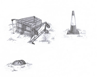
These are items for the outside of the enclosed area of the ride, or for just inside of the fence. Normal, everyday items that you find in restricted areas. These help to identify further that the ride is deserted and abandoned. I thought it would be cool ,if as the children got closer to the ride, the abandoned objects became older and more decrepid, such as a child's china doll, or a hoop, returning to the Victorian theme, as though the ride is magic and has slipped the net of time.


I had a group meeting with the others the other day, and we discussed our concerns that the ride at the moment was just in a sealed off area and that there was nothing in the environment to give it context or to suggest that anything existed away from the ride. We decided that instead of having just the lone ride, there would be ruins of other rides, wrecked and overgrown with nature. We also decided that away from the ride, nature would be in full force, over-grown and wild, but surrounding the ride, everything was dead, as though nothing can ever really harm the ride, unless it wants them to.
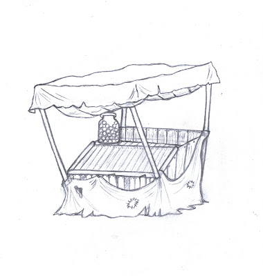
An old sweet stall.

The first sketch of the outside of the ride, in order to get a general feel for it. I haven't included the sign on the top of the main body and below the windmill, as I haven't decided on that design yet and will need to get the groups opinions. There are eyes carved into the wood, and on the bunting, subtle images to help boost the overall feel that the ride is alive and watching the children.


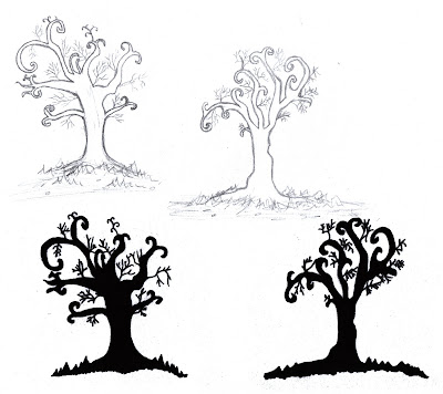
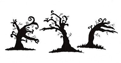
Tree designs for the environment around the ride. I wanted the trees to be stylised to enhance the general mystical feel around the ride. I drew silhouettes of the trees as well , because when the children exit the ride, the sun will be setting and I wanted to be certain that the shapes of the trees would be just as effective silhouetted.


More tree designs. This time when I was focusing on the main trees I drew them as though they were pointing towards the ride, surrounding it, trying to get at it perhaps, but never able to reach it. It also provides more of an intimidating feel as though the children are being shepherded towards the ride without even realising it. I also practised stylising a few weeds.

More silhouette tests.


Some rough designs for the rides name sign. I will make further tests, placing each sign on my sketch of the ride in 'Photoshop'. Hopefully, one will work and the others will like it too.


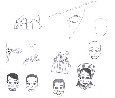
Little sketches. Dan Ryan made a rough thumbnail of a cart in his sketchbook which we all really liked, so I cleaned it up a little and enlarged it. An example of some bunting, complete with eyeball. I looked at ventriloquist dummies that would be hanging on the outside of our ride. From the reference images that I found for my moodboard, I noticed that they all seemed to have the same head shape and features. I thought it would be funny to try and make a dummy each, that looked like members of the group, but it didn't really work. From left to right we have Dan R, Dan C, Jake and me (who looks so much like a man in drag!) Ha, I might keep them, they make me laugh and they are definitely creepy! I've also drawn some patterns that I found on my moodboard on the carousel that I thought could be nice to decorate the walls with (I'll do colour tests in 'Photoshop'). Lastly, I made a very rough sketch of where the music usually comes from on a carousel. I thought that if we used that idea, the pipes could make a sound like breath and steam come from them as the ride wakes up as though it were alive.


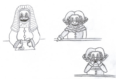
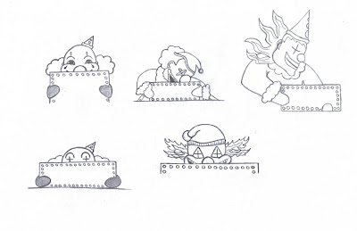
Designs for the clown puppets in the jury room. Although originally we talked about the clown in the mechanical fortune teller box looking identical to the other clowns, I thought it would make more sense if this clown were dressed as a judge, as he is the one who judges the children and sends them on a bad ride, and it fits into the court room scenario better.


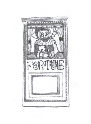
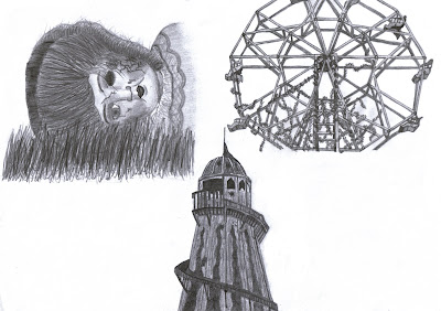
The original sketch of the fortune teller box.


A concept for the graveyard. The grass nearest the children is cutout but the further away from the children the background gets, the more realistic it looks, with real grass etc as though they have actually been transported to a completely different environment all together. I'm going to talk to my group tomorrow- I'm not sure about the furthest background, whether to show the walls of the ride or to make it appear as though they really have been transported to a completely new environment away from the ride for the time being.


A little sketch for the mausoleum that the giant zombie hand smashes out out in the final finale. If there is fire outside of it, it could look quite effective against the gloom and make the building appear more spooky and intimidating.

Pose Sheets

For my storyboards, I drew out the characters separately to the background incase Dan needed to animate them. Away from the storyboard backgrounds, the sketches work as pose sheets.

Saturday 29 November 2008

(Slightly) neater storyboards

After completing the rough thumbnails together, we each took sections of the film to storyboard neater so that it would be easier for people who didn't know our work to understand whats going on, and so that it would be easier for Dan to read when animating. My section begins as soon as the children enter the ride....