Showing posts with label Concept. Show all posts

Wednesday, 6 May 2009

Term 2

This term was mainly taken up with dissertation, especially for myself and Dan R who seem to write slower than Dan C and Jake- curse them :p. Although I thought I was doing well in it, after a tutorial with Kieran, he told me that to get a better grade I needed to research differently, which led to a lot of all night studying sessions with Dan R as he worked on his too. Hopefully it was worth all the effort that we went to, but as we wont know our grades for ages, there’s not much point worrying about it. This is not to say that no work on this project was covered this term, far from it :) (we officially have no lives, hehe).

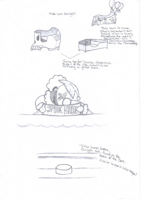
The first objects that I modelled were the carts that transpost the girls around the ride. The cart with the rounded front is for Lee and Cho, whilst the flatter fronted one is for Kitty.

Lee's cart:


I was aware that the carts would be in around 90% of the film, and in many close shots, so they would have to be modelled well with no shortcuts taken. Although now that the models are complete and I feel I could model them quickly if I were to remake them, when I first began I found it a bit challenging and came up with some hideous results when trying to build the model out of a solid cube. I realised that before I could begin the modelling I should take a moment to think about what I was doing and reassess my design. The design I was working from was a quick pencil sketch that I had made in term one, and showed only the side of the cart. After making some rough sketches, I realised that the best way foreword both aesthetically and logically was to build the cart out of separate objects like it would be in real life as opposed to trying to build it out of one object and extruding sections etc.


Above shows some of the construction proces of the cart. You can notice some changes in the design as I modelled, for example a bumper around the cart. I had always imagined the cart with a bumper, but once it was on the cart, I felt it was out of place and didn’t seem to fit into our Victorian theme, so it had to go. The cart was also appearing too big and needed resizing. Although I had measured the width to fit Cho in comfortably, it was maybe a bit too comfortable as when I added the proxy model of Lee into the cart, it looked ginormous. You can also see the way the cart was modelled out of separate sections on one side then mirrored across to complete the other half. Not wanting the cart to obviously look mirrored with every bump etc symmetrical, I used the lattice deformer to bump and dent the cart unsymmetricaly.


Once Lees cart had been completed, it was now the turn to construct Kittys. Kittys cart had to be more compact from the front as the end of the film has an embracing sequence between the girls over the two carts whilst they are inside them. To construct Kittys cart, I duplicated Lees and then pulled back the front, again using the lattice deformer. This however crushed the previous floor, wheels and front bolts and they had to be reconstructed. The lattice tool was once again used to make sure that the model didn’t share the exact same bumps etc as Lees cart. Two panels on the front also had to be completly re-modelled as this design did not include headlamps.


Dan C also needed environmental proxy models to be built so that he could begin the animation in more detail. A proxy model is a quick rough model, made to the correct proportions so that they can be replaced later in the scene by the real models. Using this method, Dan could blockout the animation which he could use both for the animatic and the final animation whilst we worked on our models. I created proxy models of the actual ride, the helter skelter and the big wheel.


Dan R also created some proxy models, and combined with mine, and Dan C’s proxy models of the characters, were placed into the scenes that we would be using for our films.

As a group we huddled around a PC, as we did when creating the blockout environment, and decided where objects would go in our new proxy environment, taking turns to position objects. As before, it took some time whilst we discussed what would look good where and why.


Director decisions:

Whilst we worked on our individual tasks, I made sure that I was kept updated with all the work the others were producing, and made sure to show them mine for their feedback also. Usually we work together at Uni, but this term due to the dissertation, it meant that it was more convenient to work at our separate homes, where it was less distracting and we could concentrate on writing. I had to make some slight directorial changes to Jakes and Dan C’s work, but nothing major: Jake sent me some screenshots of the character Kitty he was creating where I suggested that her nose round the sides needed to be more defined. I also didn’t feel that her teeth were quite right in style and Dans and Jake agreed. After a few attempts Jake created teeth that much better suited our overall film style :)


The only thing of Dans that I wanted to alter was the shot where Cho gets her bum stuck whilst going through the fence as I felt it needed more exaggeration. It wasn’t a big deal, and as time was short it didn’t need priority. However, I told Dan that if there was time at the end, I wanted that pose exaggerated. Its not even the end of the project and he managed to find time to fix it for me :D

The medieval room also had to be axed. This wasn’t a directorial choice but more of a group realisation as we could tell that with the dissertation taking up so much time there just wasn’t going to be time for this room. The room also wouldn’t affect the narrative at all, so off it was axed!

Thursday, 4 December 2008

Layout Drawings

I created a layout drawing so that it would be easier for my group to see how I viewed the surrounding environment for the ride. When I showed it to them I was happy to see they imagined it the same way. Great minds think alike! This image isn't up to the best standard, so hopefully if i get time later I can improve on it. At the moment its clear enough to serve its purpose :)


I tried the cutout filter for this one in 'Photoshop' because as a group we've used it successfully on our work previously, like in the Gargoyle animation. Although I think it is too much to completely render out the film in this style, I think it does work well when using the tool to create individual textures for objects. A method we will probably use again.


A quick testjust for me really. The group know I like black lines around objects, a personal preference, but none of the others do :( siigh, so the outline will have to be axed!

Colour tests

Scary, scary! Big deadline tomorrow! I miss the good old days where you just handed in all your work and could go and recover at the Chinese restaurant with your friends. Now the Chinese food has to wait a few hours while we have to present our work to the whole class :S Ah well.
Anyways! Here be some colour tests that I constructed.

Normal tree colour. I feel that we need normal trees in our environment as well as tinted ones so that at first glance the environment appears normal but on a second glance, it is much more mysterious... adds to the whole mood of the piece :)
After working on my film analysis essay, I have become really interested in colour symbolism and how artists incorporate it into their work, so I thought it would be cool to add some in our project as well, by finding trees that look creepy tinted, but also represent something. I thought about having one side of the glade that surrounds the ride have positive coloured trees mixed in with the normal trees, and on the other side, trees tinted that represent danger etc. This represents the two parts of the ride, the good one for good people and the bad one for bad people.

Although purple looked mysterious, it didn't really fit in with what the trees are meant to represent. However it did inspire the colour for the main body of the ride, as its meaning really worked well there. I spoke to the group about it and it was decided.


Although as with all colours, green has both good and bad representations, neither side again really fitted in too much. So at the moment this is in my mental 'maybe' category.


Yellow fits in perfectly in the negative representations and would work well against blue. So amongst the normal trees, look out for blue trees on one side of the ride and yellow on the other!


A test for the old market stall colours. I couldn't decide which one I liked the best visually, between pink and blue, as I thought yellow seemed a bit bright. I chose red, returning to the colour symbolism theme- pinky/red as a warning about the ride perhaps :S


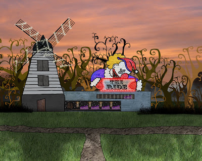
A test for the sign above the entrance to the ride. When I showed the group we decided against having a clown on the sign altogether as the clown gave the impression that the ride could be a fun house. We thought it a better idea if the ride remained looking neutral so that the audience would have no idea what sort of ride the characters would be entering and it be a surprise.

Designs for the exterior of the rides wall. They were inspired by looking at the patterns on the carousels that were in my moodboards.


More tests. (Just click the image to enlarge and read the text).


Although judges always wear black, when I was sketching out the design, I had it in my head that he would be wearing red. However, after a quick colour test I realised that wouldn't really work as the audience might not be able to recognise him as a Judge or just think that I'd got the colours wrong accidentally. I like this test because it looks like he's a deranged news reader :)


The clowns in the jury when the girls enter the room. They are completely still.


The clowns when the girls turn back after making the wrong decision after the Judge asks them a question.


A quick wave test. I don't want the waves in Kittys room to be stereotypical wave shapes. I prefer it slightly stylised like above.

Sunday, 30 November 2008

Concept sketches

Here are some concept pencil sketches for the exterior of the ride, the jury room and the graveyard.


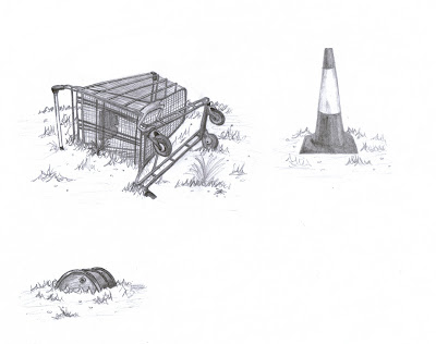
These are items for the outside of the enclosed area of the ride, or for just inside of the fence. Normal, everyday items that you find in restricted areas. These help to identify further that the ride is deserted and abandoned. I thought it would be cool ,if as the children got closer to the ride, the abandoned objects became older and more decrepid, such as a child's china doll, or a hoop, returning to the Victorian theme, as though the ride is magic and has slipped the net of time.


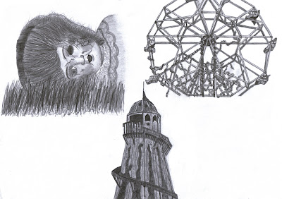
I had a group meeting with the others the other day, and we discussed our concerns that the ride at the moment was just in a sealed off area and that there was nothing in the environment to give it context or to suggest that anything existed away from the ride. We decided that instead of having just the lone ride, there would be ruins of other rides, wrecked and overgrown with nature. We also decided that away from the ride, nature would be in full force, over-grown and wild, but surrounding the ride, everything was dead, as though nothing can ever really harm the ride, unless it wants them to.

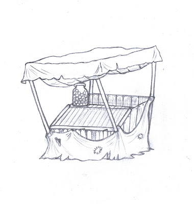
An old sweet stall.

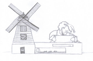
The first sketch of the outside of the ride, in order to get a general feel for it. I haven't included the sign on the top of the main body and below the windmill, as I haven't decided on that design yet and will need to get the groups opinions. There are eyes carved into the wood, and on the bunting, subtle images to help boost the overall feel that the ride is alive and watching the children.


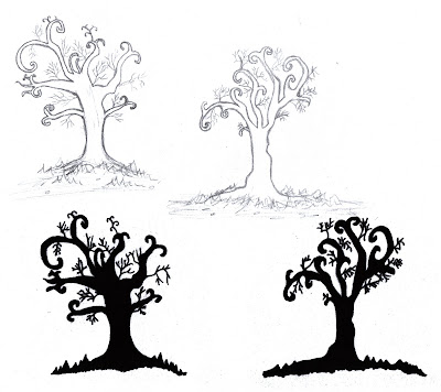
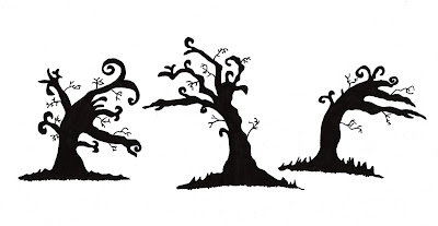
Tree designs for the environment around the ride. I wanted the trees to be stylised to enhance the general mystical feel around the ride. I drew silhouettes of the trees as well , because when the children exit the ride, the sun will be setting and I wanted to be certain that the shapes of the trees would be just as effective silhouetted.


More tree designs. This time when I was focusing on the main trees I drew them as though they were pointing towards the ride, surrounding it, trying to get at it perhaps, but never able to reach it. It also provides more of an intimidating feel as though the children are being shepherded towards the ride without even realising it. I also practised stylising a few weeds.

More silhouette tests.


Some rough designs for the rides name sign. I will make further tests, placing each sign on my sketch of the ride in 'Photoshop'. Hopefully, one will work and the others will like it too.


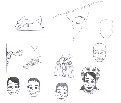
Little sketches. Dan Ryan made a rough thumbnail of a cart in his sketchbook which we all really liked, so I cleaned it up a little and enlarged it. An example of some bunting, complete with eyeball. I looked at ventriloquist dummies that would be hanging on the outside of our ride. From the reference images that I found for my moodboard, I noticed that they all seemed to have the same head shape and features. I thought it would be funny to try and make a dummy each, that looked like members of the group, but it didn't really work. From left to right we have Dan R, Dan C, Jake and me (who looks so much like a man in drag!) Ha, I might keep them, they make me laugh and they are definitely creepy! I've also drawn some patterns that I found on my moodboard on the carousel that I thought could be nice to decorate the walls with (I'll do colour tests in 'Photoshop'). Lastly, I made a very rough sketch of where the music usually comes from on a carousel. I thought that if we used that idea, the pipes could make a sound like breath and steam come from them as the ride wakes up as though it were alive.


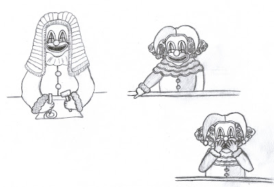
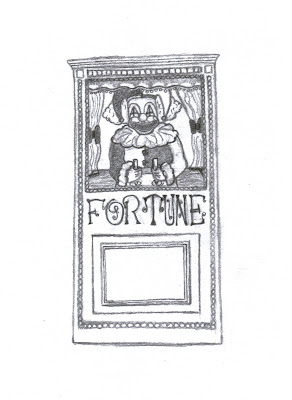
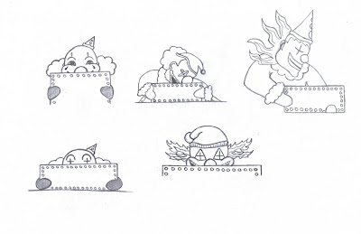
Designs for the clown puppets in the jury room. Although originally we talked about the clown in the mechanical fortune teller box looking identical to the other clowns, I thought it would make more sense if this clown were dressed as a judge, as he is the one who judges the children and sends them on a bad ride, and it fits into the court room scenario better.


The original sketch of the fortune teller box.


A concept for the graveyard. The grass nearest the children is cutout but the further away from the children the background gets, the more realistic it looks, with real grass etc as though they have actually been transported to a completely different environment all together. I'm going to talk to my group tomorrow- I'm not sure about the furthest background, whether to show the walls of the ride or to make it appear as though they really have been transported to a completely new environment away from the ride for the time being.


A little sketch for the mausoleum that the giant zombie hand smashes out out in the final finale. If there is fire outside of it, it could look quite effective against the gloom and make the building appear more spooky and intimidating.

Pose Sheets

For my storyboards, I drew out the characters separately to the background incase Dan needed to animate them. Away from the storyboard backgrounds, the sketches work as pose sheets.

Saturday, 18 October 2008

Concept Work for Pitch and Original Story Direction.

Here be the original concept art that I made for and in some cases included in my pitch (also I do realise the pencil sketches are realy bad, but they were just there for quick reference!):
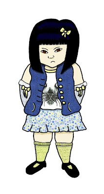
Character designs:


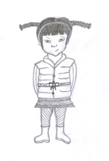
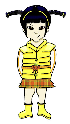
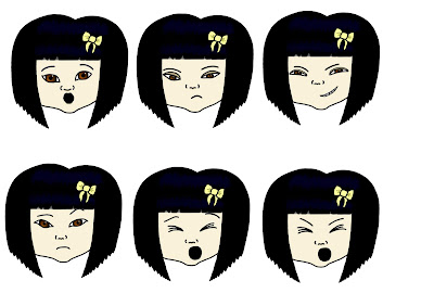
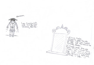
Above is an expression sheet for Cho. For some reason the text hasn't come out, so her expressions from left to right are: surprised, bored, mean, unimpressed, yawn, scream.


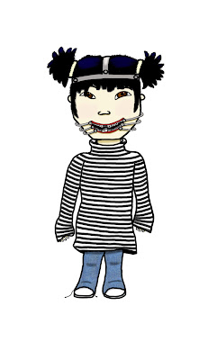
A design for an unused character.


Setting and story:


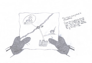
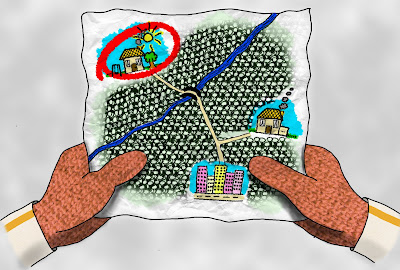
The sisters looking at a map lost....


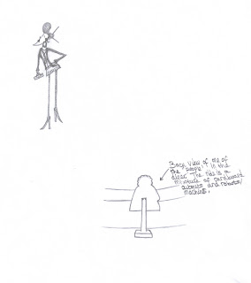
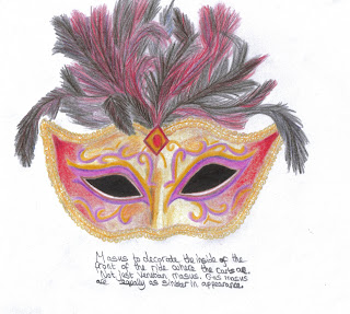
(An example of a mask. I thought the front of the ride where the carts are,could be decorated in masks and puppets as these are classic spooky objects which can't be overused.)

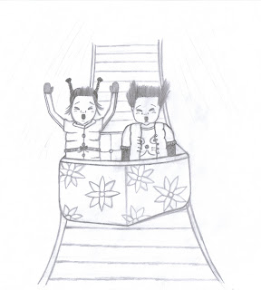
The sisters find themselves in front of a desolate funfair ride in the middle of nowhere. As they turn to leave the ride starts up, (lights and music begin) and the eldest, gleefully seeing her sisters discomfort, gets in a cart. The others follow and join her. Cho next to Lee in the front and Kitty in the back.


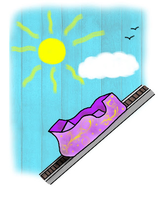
The cart with the sisters in, ascends....


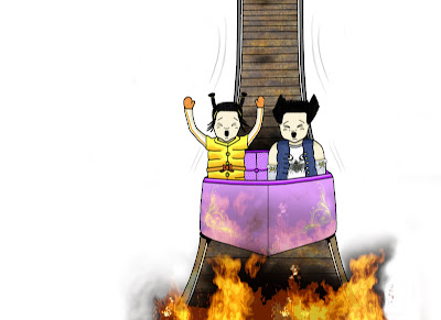
... the front of the cart where the twins are, breaks off and plunges downwards and into their bad ride.


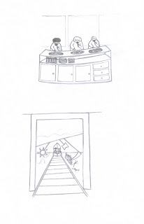
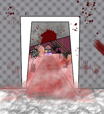
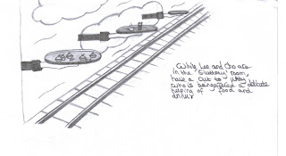
Examples of rooms that the twins could find themselves in. The rooms were to be based loosely around the seven deadly sins. Here is an example for gluttony showing robotic people eating continuously and a 'wrath' based room where there is use of war and weapons etc.


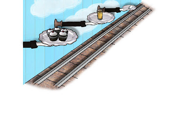
A contrast to the gluttony room, where Kitty would be given delicate treats etc on a silver platter.


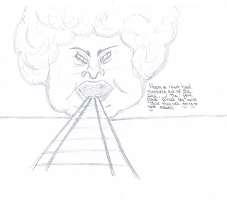
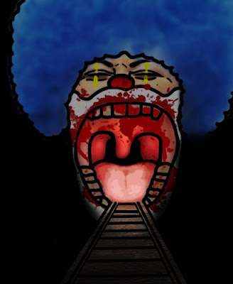
The final finale, where the twins would be eaten by a massive chomping mouth. I want the film to have a happy ending with all three sisters leaving the ride alive and with the elder two having learnt something (but not in a soppy way!). At this point I'm not sure how the ride will end, this was just a basic idea, as I didn't think it worth developing unless my idea got picked. Now that it has, the ending, along with the rest of the story will have to be discussed together with my whole group until we can plan something that we are really happy with.
Story Origins:
The idea for the story came about last year when we thought that the next project we would be starting, would be another group activity (it turned out not to be). Myself, Dans and Jake, tried to find a theme we would all be happy working on. We agreed on funfairs as we all like to create work along the spooky genre. We also discussed having two different experiences within the ride. I developed the idea at the time, by adding the seven deadly sins theme and the style our animation would look like. As we couldn't work in a group that term, the idea was discarded. When it came to this term to pitch ideas, I asked the others if I could develop the idea further, with characters etc and concept work. They agreed as I had come up with alot of the ideas previously.

Blockout:

I created a rough blockout for my pitch to show the possibility of the very dramatic camera angles my outward setting could allow. Hopefully, with the group, we can use this in the animatic and to work on shots for our storyboard. I plan for us to make as a group, a blockout of the other rooms, for the same purposes, after we have all decided on a story that we are happy to pursue.